
Gor
Forum Replies Created
-
AuthorPosts
-
Gor
ParticipantThanks for the answer Bill,
I ignored that might be so. I thought it was something generic and you could see on any device as same as on desktop pc.
thanks master!!
ParticipantThank you Master 😉
ParticipantWell done Master!!
That was what I wanted 😉
Thank you very much.
Participantthanks bill,
I prefer the full text descriptions in the same page, I will try to fit them with 400 characters.
ParticipantOk well done!
I didn´t know the second option, I think I’ll choose it.
I have tested and seems that works great.Thanks once again
regards
Gorka
ParticipantHello bill,
thanks for the solution
this solves the problem of margins on pages and post. But I still have the problem by introducing the videos directly with the url in the posts.
As a temporary solution I have writed the code by giving iframes with specific height and width, now they fit well on my smartphone but they are too small on monitor views
<iframe width="260" height="146" src="//www.youtube.com/embed/J1UyiKNaoeg" frameborder="0" allowfullscreen></iframe>I would like to have a standard width and height and they will change to different margins tablets or smartphones.
I tried changing the percentage of the width
. video-content {
width: 86%;
padding: 2%;
}
adding it to the code you gave me, I found it on line 1290 of style.css within / * Small Tablets & Phones * / but does nothing.
sorry for the inconvenience
Gor
ParticipantWell done Master !!
I have tried in to ways. At last this is all code I have added to work fine:
#nav-bar {
	border-radius: 20px 20px 0px 0px ;
	-moz-border-radius: 10px;
	overflow: hidden;
}

.front,
.flexslider img,
#page-wrap {
        border-radius: 20px 20px 20px 20px;
        -moz-border-radius: 20px;
        -webkit-border-radius: 20px;
}

@media only screen and (max-width: 767px) {

     .flexslider img {
          -webkit-border-radius: 0px 0px 20px 20px !important;
          border-radius: 0px 0px 20px 20px !important;
     }

}

.wrap {
     border-radius: 20px;
     -moz-border-radius: 20px;
     -webkit-border-radius: 20px;
     overflow: hidden;
}
and it seems it works perfectly.
Thank you very much.
Gor
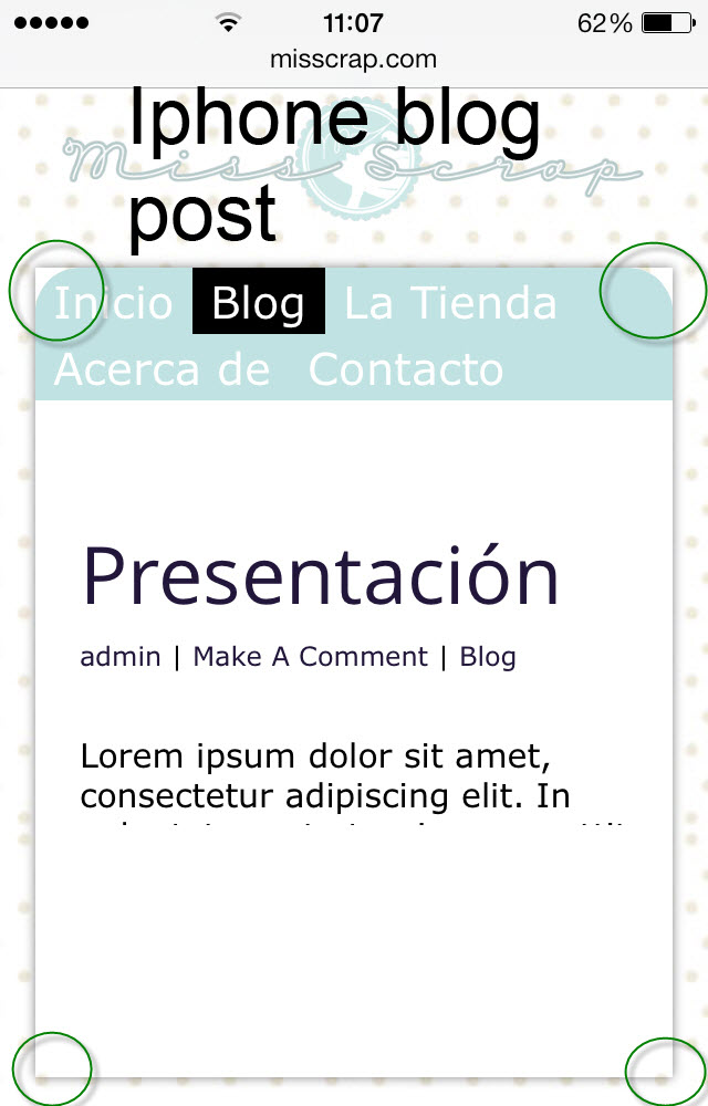
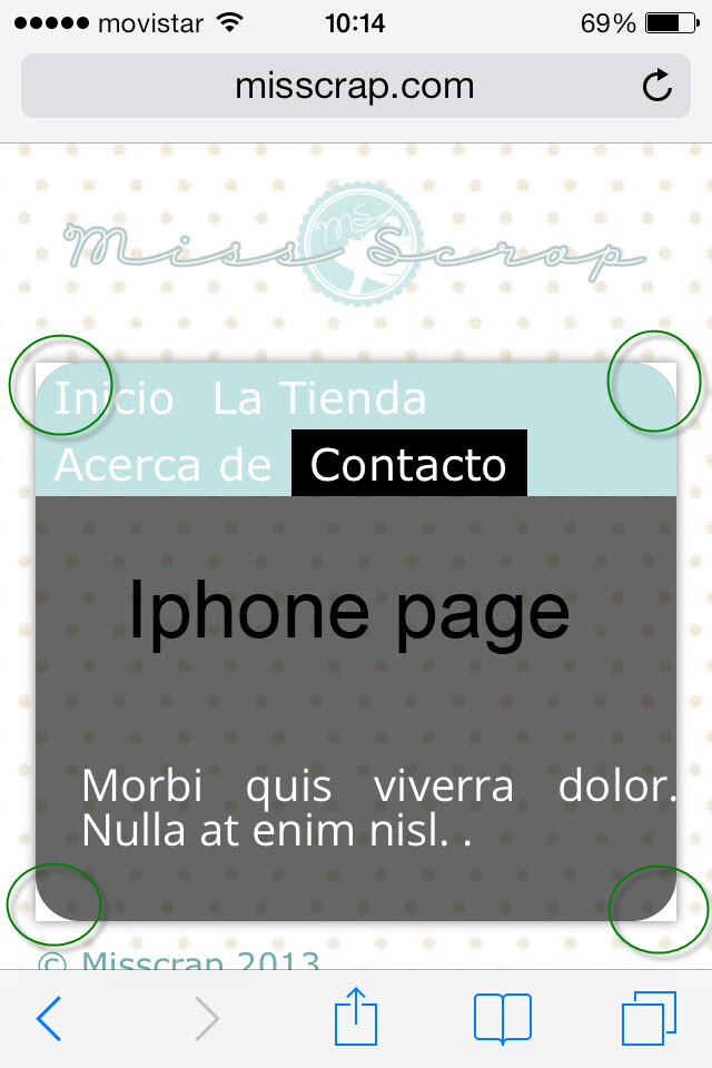
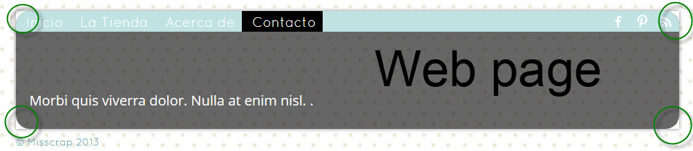
ParticipantThere are two more pictures left
Attachments:
ParticipantGood morning Bill
I’ll add some pictures of example, I think a picture is better than a thousand words 😉
With green circle I remarked the areas that should disappear.
The pictures I have taken are from my pc and my smartphone ( those are the supports with which I can make comparisons ).
Custom Css code I have used:
#nav-bar {
border-radius: 20px 20px 0px 0px ;
-moz-border-radius: 10px;
overflow: hidden;
}.front,
.flexslider img,
#page-wrap {
border-radius: 20px 20px 20px 20px;
-moz-border-radius: 20px;
-webkit-border-radius: 20px;
}Web home page picture is like I want all the templates.
sorry for the inconveniences
ParticipantGood evening,
Maybe I´m didn´t expressed well, my English still is limited … I have to learn a bit more 😉
With the code you’ve provided I solve the slider cover ( perfectly ), but I also like to add that property to all the pages and posts. All templates roundered.
I have no words for how fast you solve my doubts, I´m very glad.
Regards
Gor
ParticipantWell done Bill !!
Thanks a lot
Regards
Gor
ParticipantParticipantWell done , perfect ! 😉
Participanthttp://atapbi.com/ it’s still under construction
thank you very much
ParticipantHi Bill,
Everything is ok except hide the time of tweets,I applied the code in Custom CSS, clean the cache but the time was still there.
Thanks for the other resolved questions, I´m so glad.
ParticipantHi Bill,
I´ve another question,
I would like to put more flags ( another languajes ) the same place, but on one row from left to right, I’ve tried but they goes down to up .
Thanks
Gor
ParticipantI have done, perfect !
Thanks a lot,
Gor
-
AuthorPosts


