Dandelion222
Forum Replies Created
-
AuthorPosts
-
Dandelion222
ParticipantAh! Thanks!
ParticipantYes! I had it all except the hover state. Thanks!
ParticipantGreat! Thanks!
ParticipantThat does it. Thank you!
ParticipantAh, that was it. I had just a few that must have been posted before I turned off comments. Thanks for the lead. 🙂
ParticipantYes! That worked. Thank you so much for this extra help!!
ParticipantOh sorry, I forgot to reference the thread. Here it is: https://support.organizedthemes.com/forums/topic/how-to-hide-post-data/#post-37251
ParticipantI have not. But I will try that now. Thanks for the tip!
ParticipantBill,
That is what I tried before I wrote to you. I should have said. I assumed I just picked the wrong thing to change. I just tried again and it had no effect. See screenshot.
Attachments:
ParticipantGreat. Thank you!
ParticipantHmmm. I changed the format to image and set the “featured image” to a pic that is 970 px wide. But it doesn’t go the full width of the page. The sidebar still comes all the way up.
ParticipantWow. Thanks for sharing the whole toolbox Bill. And for the tip about checking the style sheet. I have written CSS from scratch, but don’t have much occasion to in recent years. I’ll have some fun with this. Thank you!
Have a great weekend!
ParticipantYes! It is getting there! Now I need to lose the shadow, make the text bigger, and I think center it.
ParticipantSomething interesting happened when I added the .boxgrid h4 definition and changed the color to a blue. It only effected the first featured box. And it dropped the drop shadow. (Not that i’m sure I need it.) All the rest of the boxes have the same text style as before.
ParticipantThank you! Can I also use the boxgrid h4 to change the size of the text there without effecting other text in other areas?
ParticipantThat definitely gives me what I need in terms of colors. Thank you! However, still having an issue with presentation. I don’t think it’s so much that I needed to offset the dropdown, but I would like the width to match the parent it drops down from. I realized it sticks out because it is wider. I’d really like it to just drop straight down. Or more so than it is. Because it goes so much farther to the right is I think why there’s a disconnect.
ParticipantCan you also tell me what selector to use for the link text and link hover in the dropdown area. I can’t see the text anymore. I tried just adding “color: #ffffff; to what you sent before but that didn’t work.
ParticipantGreat! Thank you!
ParticipantThanks for your help, I will give that a try.
ParticipantThanks so much! I will give that a try. I have no trouble seeing the source code.
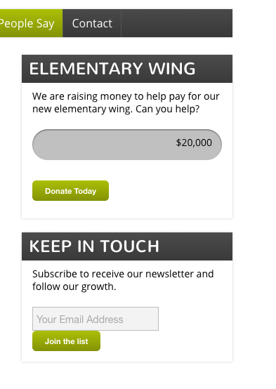
ParticipantRe the Donate box – that was it. Thanks!
ParticipantOkay…the Newsletter is looking good. That CSS worked. Thanks!
The donate is a bit of a mystery.
Speaking of styling – is there a way to style just one link different from the others? Like we have on the current page? http://3mariposasmontessori.com/about-us/staff/
ParticipantI don’t need the button to sit beside it, but I’ll give your code a try. It’s okay to be below, I just don’t want them to touch.
ParticipantI am using Chrome
ParticipantHere’s a screenshot of what I see…
Attachments:
-
AuthorPosts