
ccsl
Forum Replies Created
-
AuthorPosts
-
ccsl
ParticipantHi Bill,
Thanks so much! That has fixed the problem with the box. Now it looks like it is supposed to be there, and with a bit of clever tweaking on my part, I have stopped the text from running off the edges–mainly by shortening the names of events!
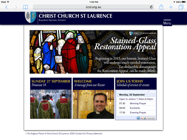
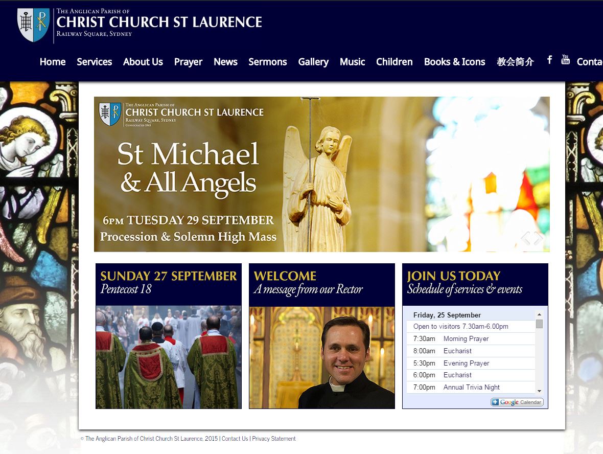
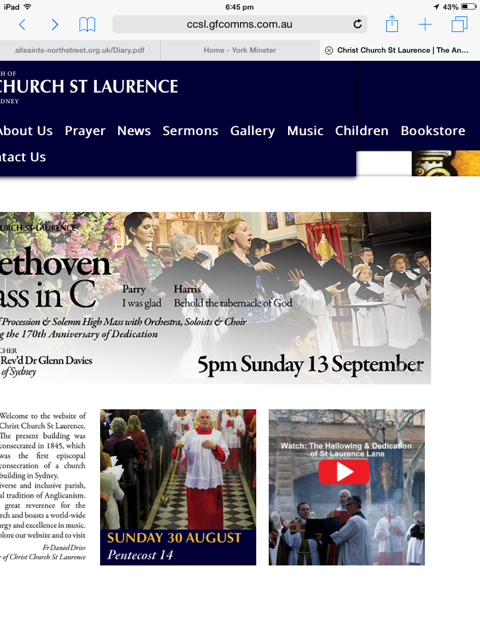
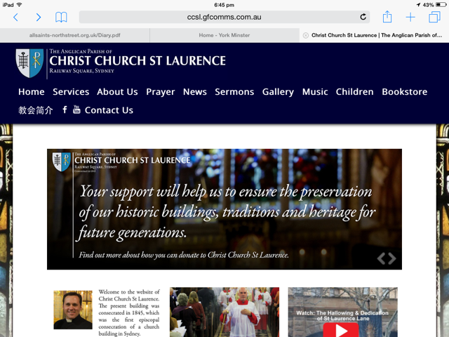
However I have noticed a glitch has crept back in. On an ipad, the right widget is slightly longer than the others (see the screenshot). However, this doesn’t appear the case on a computer (see the second screenshot). What have I done wrong? The right widget is made up of two parts: an image widget, which is the blue box saying “JOIN US TODAY” and below that a text widget which takes the following feed, from Google:
<!– Responsive iFrame –>
<div class=”responsive-iframe-container”>
<iframe src=”https://www.google.com/calendar/embed?title=Schedule%20of%20services%20%26%20events&showTitle=0&showNav=0&showDate=0&showPrint=0&showTabs=0&showCalendars=0&showTz=0&mode=AGENDA&height=199&wkst=1&bgcolor=%23ffffff&src=eoigu2b0fqck637kcrj6tbpthg%40group.calendar.google.com&color=%2323164E&ctz=Australia%2FSydney” style=” border-width:0 ” frameborder=”0″ scrolling=”no”></iframe>
</div>I used the responsive frame <div class… etc so that it was the same size on all devices and the Google component filled the widget on all devices. But now, I just need to get the widgets to be exactly the same height on all devices, and I can officially say our new website is complete.
Thanks so much,
SimonAttachments:
ParticipantHi Bill,
I think this will be the last time I need to practice on your kindness, patience and knowledge!
Our website has now gone live, http://www.ccsl.org.au and I have changed the way that the Google Calendar works in the widget–I have now exported Google’s own HTML into a text widget. That was the only way I could ensure it updated properly (the GCal plugin was not functioning properly).
However, I can not get the calendar to fit properly. There are two issues I would like to address, the first much more important than the second.
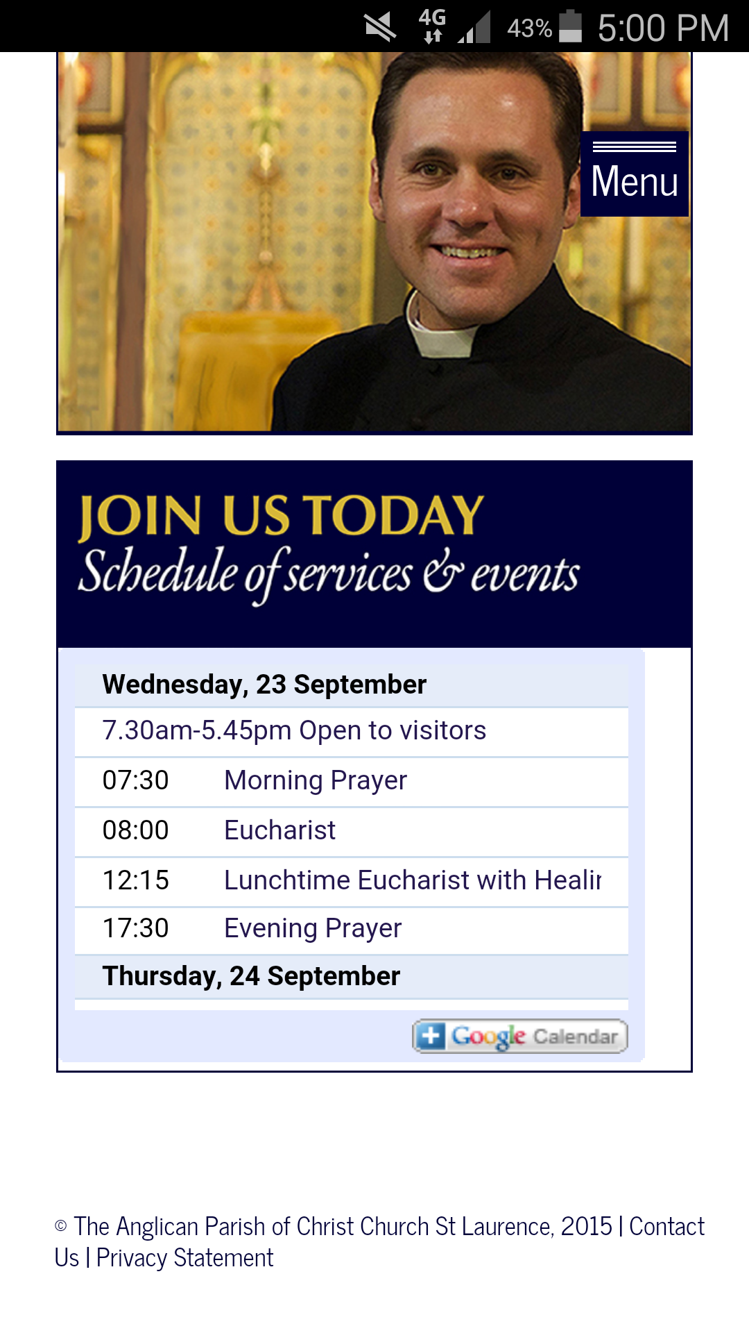
1. Is it possible to set the “fill” or “background” of the right widget to be the same colour as Google’s light-blue background? That way, no one will notice the little white lines on the right and on the bottom, where the calendar isn’t as big as the widget is. They are even more noticeable on a phone.That is my ‘quick fix’, but my ‘ideal fix’ is,
Is there a way to customise the Google HTML so that it completely fills the widget (and is proportional so it fills it on every device, computer, phone, ipad?) I would also love to be able to tell it NOT to cut text off (you see the 12.15pm Wednesday or 7pm Friday events are getting cut off, instead of running over two lines). I understand this may be much more complex, so I am happy with the quick fix if that’s all that is possible, but I would really love it if this was able to be done.Many, many thanks
SimonAttachments:
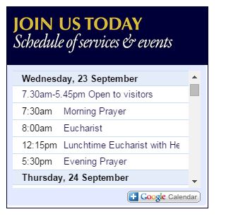
Participant(This shows you what I have in mind.)
Attachments:
ParticipantYes, that’s what I’m seeing. I did wonder if it was possible to align the left margin of the left widget with the slider, and the right margin of the right widget with the slider. But, I’d rather address the other things I mentioned first (the left-justified submenus and the box around the content on a PC)
ParticipantMany, many thanks. I have replaced the .css with the text above. The widgets are still not centered and on a computer, I have lost the shadow box that surrounds the content. Is it possible to have that box only on a computer, but still have it not show up on the ipad/tablet/phones?
And, is it possible to left-justify the subheadings (drop down menus) but keep the main navigation bar centre-justified? I think the drop downs look odd centre justified.
Thank so much again.
ParticipantHi Bill,
These timezones are tricky things! While CS-time has been asleep, I’ve managed to fiddle with the site a bit and (I think) solve some problems. Now, it appears to be responsive on most devices that I’ve checked which is excellent.
The things I could not fix:
– The solution you gave me above to keep the header/logo the same size on every page means that, on a mobile phone, the logo does not scale-to-fit but runs off the screen. Is it possible to have the header/logo the same size on every page, but still have a responsive logo that shrinks according to the device? (look at the homepage and then on the ‘services’ tab, you’ll see it moves up slightly)
– Is it possible to centre justify the menu/navigation buttons but keep them where they are (not move up to the right of the logo)? But only on a computer/tablet. I think they look good left-justified on a mobile screen, and easier to use.
– Space the three widgets so they line up with the margins of the slider on both sides. Every thing I try to do to change their size sends them onto a new line, or doesn’t work on ipad etc.
– Lastly, is it possible to NOT have a background on tablet/mobile devices, or the lovely “shadow box” that shows around the content on a PC? I do not like the way it looks on ipad, I think it’s too busy and would just prefer a white background.
Many thanks, Bill. I do hope these will be my last questions!
SimonParticipantI have restored the style.css (did some quick research to check I wouldn’t lose content). Everything is back to the original format. I’ll create a child theme now, but in the hope that this reaches you while it’s still daytime central standard time, my chief objects now are,
– remove any trace of the sidebar
– “scale in” the content frame, so that on a standard-sized monitor I can see more of the stained-glass background. (I can edit the background image to meet the content frame.) Because I have no need for a sidebar, I think the page is too ‘wide’ at the moment.Many thanks for your suggestions and help!
ParticipantThanks so much Bill. I’m hoping this reaches you in time–does doing that (reinstalling the theme) mean I’ll lose all the content I’ve created? I’ve never done that before and have built several pages now.
I made those edits because I wanted to see more of the background of stained glass than I was previously seeing.
ParticipantHi Bill,
Two more screenshots of iPad in portrait and landscape mode. The landscape portrait here shows the same as my other colleague saw, which is fine (possibly a bit too much padding on either side of content, but I can live with that). The iPad portrait view is quite odd, as is one of the Mac views I saw above.
Many thanks
Attachments:
ParticipantThanks so much for your wonderful help, Bill.
Some further gremlins:
http://ccsl.gfcomms.com.au/wordpress/
– At the current time, the navigation bar is left-justified. If I move it to centre justify, it goes up next to the logo. Is it possible to keep it in its current position (beneath the logo) but centre it so it is in the centre of the page?
– I have noticed a few more gremlins when experimenting on colleague’s Macs and Ipads. See screenshots below sent to me from Mac Users. Is there something in the display settings/responsive CSS causing this? Also, when an ipad is rotated to be portrait view, it really messes up with the background image, header etc. It would be better if a tablet in portrait view defaulted to the same view as a mobile telephone. Is that possible?
Ideally, I thought an ipad (on landscape view) and Mac browsers would just scale the website that I see on my PC to fit their screens but perhaps that isn’t what happens?
Many thanks again, Bill.
Attachments:
-
AuthorPosts


