
Widget styling
Support Area › Forums › Foundation › Widget styling
- This topic has 9 replies, 2 voices, and was last updated 7 years, 7 months ago by
Dandelion222.
-
AuthorPosts
-
August 30, 2016 at 15:36 #37655
Dandelion222
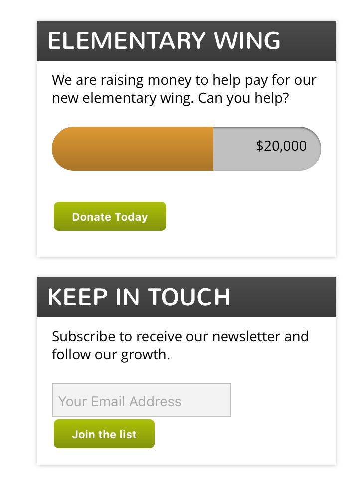
ParticipantThe widgets in the sidebar of this page don’t look quite as desired. The “donate” one had me reference how close we were to the goal. But that progress isn’t reflected and it’s just a grey area with “$20,000” floating in it.
The Email newsletter widget has the button touching the email address form.
August 30, 2016 at 15:49 #37656Bill Robbins
ModeratorGood Afternoon,
I took a look at your sidebar widgets. I’ve attached a screenshot of what I’m seeing with the donate widget. The burnt orange color represents the progress that’s specified in the widget. If you’re looking for something else there, let me know what you’re going for.
The newsletter button is bumping down due to the text inside the button itself. One thing that’s not so easy to do with CSS is have two items sit side by side when we don’t know what their width will be. Space is tight in the sidebar width wise and it looks like this fell just outside of what will fit on one line by default.
We can shorten the length of the email input so the button will fit beside it. Here’s how to do that:
- In your WordPress dashboard click on the Appearance section and choose Theme Options.
- From the tabs at the top, choose the Styling one.
- Scroll down to the Custom CSS box and add this:
#sidebar form#signup .email { width: 160px; } - Save your changes.
Let me know how it goes,
BillAttachments:
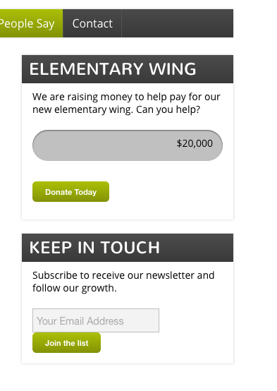
August 30, 2016 at 15:58 #37658ParticipantHere’s a screenshot of what I see…
Attachments:
August 30, 2016 at 15:58 #37660ParticipantI am using Chrome
August 30, 2016 at 15:59 #37661ParticipantI don’t need the button to sit beside it, but I’ll give your code a try. It’s okay to be below, I just don’t want them to touch.
August 30, 2016 at 16:00 #37662ModeratorTake out the % symbol from the box. It’s in the code and causing the width of the bar to be set at 60%%. Some browsers are more forgiving of something like than others. See if that won’t cause the line to progress to display in Chrome for you.
August 30, 2016 at 16:02 #37663ParticipantOkay…the Newsletter is looking good. That CSS worked. Thanks!
The donate is a bit of a mystery.
Speaking of styling – is there a way to style just one link different from the others? Like we have on the current page? http://3mariposasmontessori.com/about-us/staff/
August 30, 2016 at 16:04 #37664ParticipantRe the Donate box – that was it. Thanks!
August 30, 2016 at 16:08 #37665ModeratorYou can style any menu item separately from the others. Each menu item has a unique ID that can be used to change it only. You could add something like this to the Custom CSS in the theme options:
#navigation li#menu-item-60 a {
	background-color: #000;
	color: #aabf03;
}
That would change just the “contact” menu item on your site so it has a black background and green letters. The only way I know to find the ID is to look in the source code of the page when it’s being viewed. Most browsers will let you right click on the background of the page and select “View Source” to do that. You’ll need to look through the code just a bit until you see the menu item that goes with the one you want to change. Then just replace the 60 in the snippet above with that ID number. Then you can change the colors to fit your needs too 🙂
August 30, 2016 at 16:17 #37666ParticipantThanks so much! I will give that a try. I have no trouble seeing the source code.
-
AuthorPosts
- The topic ‘Widget styling’ is closed to new replies.