
Top navigation not correct on mobile devices
Support Area › Forums › Foundation › Top navigation not correct on mobile devices
Tagged: mobile
- This topic has 13 replies, 2 voices, and was last updated 9 years, 8 months ago by
Bill Robbins.
-
AuthorPosts
-
August 7, 2014 at 10:07 #21518
Lara Marsh
ParticipantBill –
For the Essence Hospice website (link above) we are getting a really bad display of the navigation links at the top. They wrap around and overlap and it’s nearly impossible to use them. Do you know how I can fix this?
Thanks –
LaraAugust 7, 2014 at 10:18 #21519Bill Robbins
ModeratorHey Lara,
Good question. I would look at updating to the current version of the theme. You can download it from the right hand sidebar on our support site.
It changes out the menu on mobile devices for a select menu that fits better and is easier to use.
That version also has automatic updates to make updating in the future easier.
If I can help, let me know.
Thanks,
BillAugust 7, 2014 at 14:58 #21524ParticipantThanks, Bill.
My theme is not saying it needs to be upgraded. Are you suggesting I reload it anyway? I am hesitant to try that. 🙂
Lara
August 7, 2014 at 15:03 #21526ModeratorUpdates from the dashboard were added in a version later than the one you’re using. That’s why you’ll need to download here to get the update. You can install it like you would a new theme. It will leave your current foundation theme alone. I would copy out your settings, especially your custom css so you can add them into the next version.
August 7, 2014 at 19:22 #21533ParticipantBill –
I updated the theme. It’s causing a few problems, namely the image size at the top of the home page and Dreams page. I am working through those. However, this update did not fix the mobile display issue. I think it may be the way I created the menu. Please see our conversation about this at https://support.organizedthemes.com/forums/topic/element-positioning/#post-10952Is something there not working right for mobile devices?
Thanks.
August 7, 2014 at 19:35 #21534ModeratorLara,
Looking at the source code of that page, the output of the mobile menu is missing. Let’s try this. Go to the Appearance section and select Menus. Choose the “locations” tab and make sure that your main menu is assigned to the “Left Side Navigation Bar” location and then save your menu. Hopefully that will bring up the output.
If that doesn’t do it, we’ll need to check the header.php file and make sure it’s correct because it looks like a section is missing.
Let me know what you turn up,
BillAugust 7, 2014 at 19:50 #21535ParticipantBill,
Thanks. I had it set to Right Side Navigation Bar. I changed it to Left. Mobile output still wonky.
LaraAugust 7, 2014 at 19:53 #21536ModeratorIt’s still not there in the code. Could you email over a login so I can take a look for you? You can make a private post here or email it to support@organizedthemes.com
Thanks
August 7, 2014 at 20:15 #21537ModeratorPerfect. It looks like that was a modified version of the old header file. The theme added some code to the header.php file to load up the mobile menu. I added that in and it appeared for you.
The slider is made to be about 2/3 of the width of the content area with a widget spot next to it. It looks like that’s what you have now, just without any widgets in the home top yet.
If you’d like to make it full width, this is how I would go about it: https://support.organizedthemes.com/forums/topic/full-width-image-slider/
Let me know if you need any help,
BillAugust 7, 2014 at 20:17 #21538ParticipantThanks so much, Bill! I see the mobile nav now. Excellent. I’ll take a look at the article link you sent for my image issues.
Best,
LaraAugust 7, 2014 at 20:56 #21539ParticipantBill –
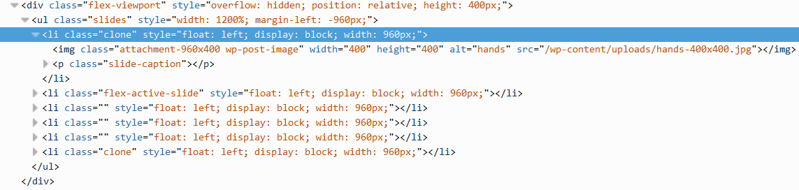
I did the suggestions in your post on making the image full width. It didn’t seem to work. I made a few other changes and was able to get the image to work on an interior page but not on the home page. On the home page, it is forcing the image to be 400 x 400 which is completely bizarre to me. I have no idea where this is being set. Here’s a snippet of the developers view on Firefox. What do you think?
Thanks again.
LaraAttachments:
August 8, 2014 at 08:07 #21549ModeratorLara,
We’re almost there. WordPress only resizes images at the point of upload, so if you change an image size, it will only affect images from that point forward.
There’s a plugin called regenerate thumbnails that you can use to resize your existing images. I went on and installed/ran it for you. That seems to have your slider back in place.
If you run into trouble, let me know.
Have a great weekend,
BillAugust 8, 2014 at 08:19 #21550ParticipantTHANK YOU SO MUCH. I really appreciate it. Looks great.
LaraAugust 8, 2014 at 08:45 #21551ModeratorFantastic. If you need anything else just let me know.
-
AuthorPosts
- The topic ‘Top navigation not correct on mobile devices’ is closed to new replies.