
Three Questions
Support Area › Forums › Live › Three Questions
- This topic has 13 replies, 2 voices, and was last updated 8 years, 7 months ago by
Bill Robbins.
-
AuthorPosts
-
August 30, 2015 at 17:21 #32377
ccsl
ParticipantHello there,
On the draft website I’ve linked, I cannot solve three problems:
– The navigation bar (header and menu) on the homepage is slightly longer on the homepage than any other page. (Look at it compared to the white pillar on the right on the homepage, then on the page called “Services”).
– I would like the footer text to align with the box around the page content.
– On an Ipad, the three widgets down the bottom of the homepage do not line up. It has two in a row, and then the third widget on a new row. Can they be scaled so it all fits onto one row, like when viewed on a PC?
Many thanks!
August 31, 2015 at 11:41 #32389Bill Robbins
ModeratorGood Morning,
Let’s see if we can point straighten these out for you.
Logo
Since we have a logo here, let’s set it’s size in CSS so that it’ll stay consistent between the home and inside pages:
- Go to your theme options page and choose the Style tab.
- Scroll down to the Custom CSS box and add this:
#logo, #text-logo { height: 75px; width: 488px; overflow: hidden; } #logo h1, #logo p { margin: 0 !important; padding: 0 !important; line-height: 1 !important; } - Update your settings.
Footer
Add this to your custom CSS to move the footer back under the page’s content:
@media only screen and (min-width: 1250px) {

	#footer {
		width: 960px;
	}

}
In most of the CSS, the header content and the logo are set to be the same width. If you want to change the header content but leave the footer as is, you can duplicate the styles that set the width and separate them so that you only end up changing the header.
iPad Widgets
I believe we can make those fit three across on an iPad. Try adding this to the Custom CSS too:
@media only screen and (min-width: 768px) and (max-width: 1024px) {

	#home-left,
	#home-middle,
	#home-right {
		width: 210px;
		margin: 0;
		padding: 10px 10px 10px;
	}

}
If you have any questions or trouble, let me know.
Have a great week,
BillSeptember 1, 2015 at 02:14 #32414ParticipantThanks so much for your wonderful help, Bill.
Some further gremlins:
http://ccsl.gfcomms.com.au/wordpress/
– At the current time, the navigation bar is left-justified. If I move it to centre justify, it goes up next to the logo. Is it possible to keep it in its current position (beneath the logo) but centre it so it is in the centre of the page?
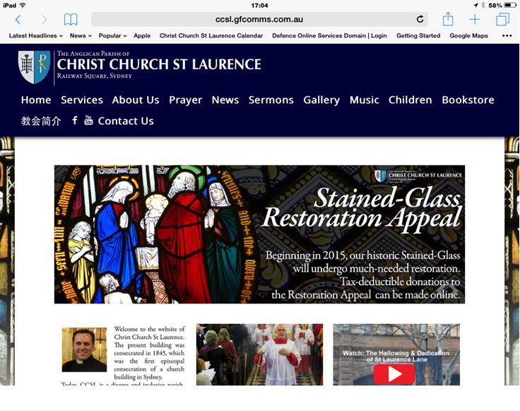
– I have noticed a few more gremlins when experimenting on colleague’s Macs and Ipads. See screenshots below sent to me from Mac Users. Is there something in the display settings/responsive CSS causing this? Also, when an ipad is rotated to be portrait view, it really messes up with the background image, header etc. It would be better if a tablet in portrait view defaulted to the same view as a mobile telephone. Is that possible?
Ideally, I thought an ipad (on landscape view) and Mac browsers would just scale the website that I see on my PC to fit their screens but perhaps that isn’t what happens?
Many thanks again, Bill.
Attachments:
September 1, 2015 at 04:16 #32419ParticipantHi Bill,
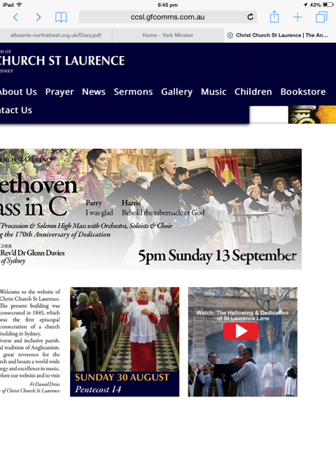
Two more screenshots of iPad in portrait and landscape mode. The landscape portrait here shows the same as my other colleague saw, which is fine (possibly a bit too much padding on either side of content, but I can live with that). The iPad portrait view is quite odd, as is one of the Mac views I saw above.
Many thanks
Attachments:
September 1, 2015 at 09:04 #32425ModeratorGood Morning,
I did notice some rather odd edits in the style.css file that I believe may ultimately make the site difficult to size properly across devices.
If I could make a bit of a radical suggestion. Make a backup of the current style.css file on your local computer. Then restore the original one from the theme. Next create a child theme where you place all of your customizations. You can override the original styles that way, but in a way that’ll be easier to work through any customization issues in the layout. Plus you’ll be able to upgrade the theme when new versions are released.
I have a page at https://support.organizedthemes.com/child-themes/ that lists some resources we have on creating a child theme if you haven’t done that previously.
Once you’ve done that, let me know and we can go from there on the customizing.
Thanks,
BillSeptember 1, 2015 at 14:36 #32447ParticipantThanks so much Bill. I’m hoping this reaches you in time–does doing that (reinstalling the theme) mean I’ll lose all the content I’ve created? I’ve never done that before and have built several pages now.
I made those edits because I wanted to see more of the background of stained glass than I was previously seeing.
September 1, 2015 at 15:27 #32451ParticipantI have restored the style.css (did some quick research to check I wouldn’t lose content). Everything is back to the original format. I’ll create a child theme now, but in the hope that this reaches you while it’s still daytime central standard time, my chief objects now are,
– remove any trace of the sidebar
– “scale in” the content frame, so that on a standard-sized monitor I can see more of the stained-glass background. (I can edit the background image to meet the content frame.) Because I have no need for a sidebar, I think the page is too ‘wide’ at the moment.Many thanks for your suggestions and help!
September 1, 2015 at 16:53 #32467ModeratorWe can absolutely make those changes for you. It’ll likely be tomorrow morning here before I have a chance to cook those up for you, but I’ll send them over as quickly as I can.
Thanks again,
BillSeptember 2, 2015 at 01:38 #32481ParticipantHi Bill,
These timezones are tricky things! While CS-time has been asleep, I’ve managed to fiddle with the site a bit and (I think) solve some problems. Now, it appears to be responsive on most devices that I’ve checked which is excellent.
The things I could not fix:
– The solution you gave me above to keep the header/logo the same size on every page means that, on a mobile phone, the logo does not scale-to-fit but runs off the screen. Is it possible to have the header/logo the same size on every page, but still have a responsive logo that shrinks according to the device? (look at the homepage and then on the ‘services’ tab, you’ll see it moves up slightly)
– Is it possible to centre justify the menu/navigation buttons but keep them where they are (not move up to the right of the logo)? But only on a computer/tablet. I think they look good left-justified on a mobile screen, and easier to use.
– Space the three widgets so they line up with the margins of the slider on both sides. Every thing I try to do to change their size sends them onto a new line, or doesn’t work on ipad etc.
– Lastly, is it possible to NOT have a background on tablet/mobile devices, or the lovely “shadow box” that shows around the content on a PC? I do not like the way it looks on ipad, I think it’s too busy and would just prefer a white background.
Many thanks, Bill. I do hope these will be my last questions!
SimonSeptember 2, 2015 at 10:26 #32486ModeratorSorry for putting you through that trouble. I do think this will ultimately get you to the right spot. Let’s start with this. In the Custom CSS box that’s in your theme options page, pull this out:
@media only screen and (min-width: 1250px) {

	#footer {
		width: 960px;
	}

}

@media only screen and (min-width: 768px) and (max-width: 1024px) {

	#home-left,
	#home-middle,
	#home-right {
		width: 210px;
		margin: 0;
		padding: 10px 10px 10px;
	}

}
We’ll keep all the changes in the child theme to make locating styles easier.
I made a copy of your child theme and just added the changes to it. You can find the one with the changes below. If you have any questions, let me know.
Thanks again,
BillSeptember 2, 2015 at 16:06 #32497ParticipantMany, many thanks. I have replaced the .css with the text above. The widgets are still not centered and on a computer, I have lost the shadow box that surrounds the content. Is it possible to have that box only on a computer, but still have it not show up on the ipad/tablet/phones?
And, is it possible to left-justify the subheadings (drop down menus) but keep the main navigation bar centre-justified? I think the drop downs look odd centre justified.
Thank so much again.
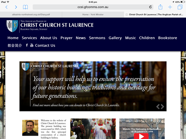
September 2, 2015 at 16:38 #32499ModeratorWe’ll get there. Can I ask one question back. This is what I’m seeing in the home widgets (see attached screenshot). Are you seeing something different or are you looking to see something different?
Thanks,
BillSeptember 2, 2015 at 16:55 #32501ParticipantYes, that’s what I’m seeing. I did wonder if it was possible to align the left margin of the left widget with the slider, and the right margin of the right widget with the slider. But, I’d rather address the other things I mentioned first (the left-justified submenus and the box around the content on a PC)
September 2, 2015 at 17:18 #32502ModeratorWanted to make sure we were seeing the same things. I think that’s the widget margin inside of the sidebar. Let’s take it out this way:
-
AuthorPosts


- The topic ‘Three Questions’ is closed to new replies.