Mobile responsiveness

Support Area Forums Forward Mobile responsiveness

Viewing 6 posts - 1 through 6 (of 6 total)
URL to the page in question: http://www.limehousetownhall.co.uk
  • Author
    Posts
  • #30518
    Avatar photoSamV
    Participant

    Hey Bill,

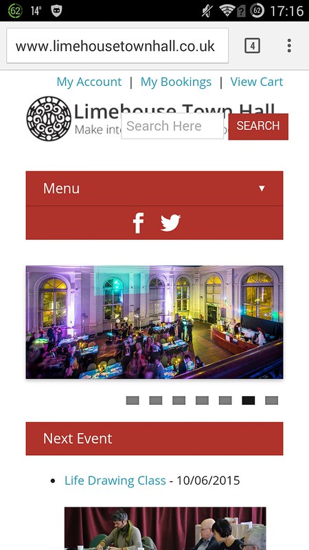
    So on our site I followed your instructions for adding a top menu and also for moving the search box out of the nav menu which looks brilliant on a full browser. However when it’s viewed on a phone, they overlap the logo ie:

    Screenshot

    Is there a way to make it more responsive? No worries if not.

    #30522
    Bill Robbins
    Moderator

    Hello Sam,

    See if this doesn’t bring the adjustments into better line on smaller screens:

    1. Go to the Appearance section in your WordPress dashboard and click on Customize.
    2. Look down for the advanced section and click on it. Then choose Custom CSS.
    3. In the box there, add this:
      
      @media only screen and (max-width: 767px) {
      	
      	#header {
      		position: relative;
      	}
      	
      	#navigation {
      		margin-top: 60px;
      	}
      	
      	#header .header-search {
      		left: 0;
      		right: 0;
      		width: 100%;
      		top: 115px;
      	}
      
      }
      
    4. Save your changes.

    Let me know if that doesn’t fit it all in together for you.

    Take care,
    Bill

    #30609
    Avatar photoSamV
    Participant

    That looks much better thanks, is there a way to lower the header logo a bit more by say 15px to allow space for the logout link in the top menu?

    #30617
    Bill Robbins
    Moderator

    Hello Sam,

    You can change the top margin to have a different fit there. Edit the snippet we used above so it’s like this:

    
    @media only screen and (max-width: 767px) {
    	
    	#header {
    		position: relative;
    	}
    	
    	#navigation {
    		margin-top: 60px;
    	}
    	
    	#header .header-search {
    		left: 0;
    		right: 0;
    		width: 100%;
    		top: 115px;
    	}
    	
    	#logo {
    		margin-top: 35px;
    	}
    
    }
    

    and see how that looks. You can increase the space between the logo and the top of the screen by changing the margin-top: 35px to a larger number. Or you can make it smaller by decreasing the number. That should let you find the right fit there.

    Have a great weekend,
    Bill

    #30621
    Avatar photoSamV
    Participant

    You need to have a button on the site that says “Buy me a coffee/drink”. You sir go above and beyond every support team I have ever dealt with. You need to charge more or at least give us a way to buy you a few drinks 🙂

    #30622
    Bill Robbins
    Moderator

    Thanks Sam 🙂 I really do appreciate it.

Viewing 6 posts - 1 through 6 (of 6 total)
  • The topic ‘Mobile responsiveness’ is closed to new replies.