
Elite Mobile Issues
Support Area › Forums › Elite › Elite Mobile Issues
- This topic has 8 replies, 2 voices, and was last updated 9 years, 3 months ago by
Bill Robbins.
-
AuthorPosts
-
January 14, 2015 at 19:56 #25550
Matt
ParticipantHey Bill,
I’m really sorry I keep bugging you with all these tweaks to my site. It’s launching on Friday so I’m kind of in a pinch. Everytime I make a change and go through the site I see more things that need to be tweaked or bugs. I’m trying to search your forums to find the answers, but sometimes it’s easier to ask my question directly.
I have noticed several issues when browsing the site on my iPhone 5 (haven’t checked my iPad yet).
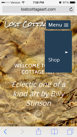
1. Nav Menu pages are not visible in drop down.
2. Hero Title is Smaller than Caption in Portrait mode.
3. Menu block Header Logo in portrait mode.
4. Hero Title is too big in landscape mode along with Caption.
5. Any way to center the Contact Us in the Footer without centering the text and affecting the desktop version?
6. Hero Title and Caption overun Feature Widget in Landscape Mode.Thanks for all you do!
January 14, 2015 at 19:56 #25555January 15, 2015 at 09:39 #25575Bill Robbins
ModeratorHello Matt,
Let’s see if we can find answers for you.
1. The mobile menu shares colors with the drop-down menu. You can set the colors that will be used with those options.
2. Sometimes when a custom size is selected for a font, it will override what’s in the media query that adjusts things for smaller screens. You can add this to your custom CSS to adjust the caption and title’s font sizes on smaller devices:
@media only screen and (max-width: 520px) {

	.hero-copy h2.hero-title  {
		font-size: 22px;
	}

	.hero-copy .hero-copy p {
		font-size: 16px;
	}

}
3. The logo has a max-width that keeps that from typically happening. If you disable it for larger screen sizes you’ll want to turn it back on for smaller ones with something like this:
@media only screen and (max-width: 520px) {

	#header #logo {
		margin-top: 15px;
		max-width: 200px;
	}

}
4. You can change that with the media query in number 2 above.
5. You can center the text widget title only in the footer, on small screens with this CSS:
@media only screen and (max-width: 767px) {

	#footer .widget_text h3.widget-title {
		text-align: center;
	}

}
Customizing things can get tricky when you throw in how the changes affect smaller screens. When you need to make some type of layout change in the future, you may want to wrap them in media queries. That way if you only intend for a change to impact the desktop layout, you can specify the browser size with a query so that it doesn’t unintentionally affect other things.
Hope you have a good launch tomorrow,
BillJanuary 15, 2015 at 15:53 #25595ParticipantOk Bill…Here’s what I got.
1. On the Nav Menu I understand that the color is controlled for the drop down in Theme Options. The issue is that my pages do not show in the drop down. They are suppose to be white, but they are invisible. I guess I sent you a bad example but none of my Text is showing in the drop down (portrait or landscape. The Text has taken on the appearance of the background color for some reason, but I spec’d it white.
2. The Logo size is not being affected when I change the width size (landscape is fine, portrait mode is behind Nav Menu). I went all the way down to 50px and no change. Not sure if I did something wrong or not. I only have the max-width disabled for the Text-Logo, but I’m using a Image-Logo so I can use a drop shadow so that should affect it, should it.
I got everything else to work. After being able to tweak the code a little.
You are a blessing Bill and I thank you for your support. If I can just get the above figured out I think I can finally leave you alone…LOL!
Could You also explain the Media query part?
Blessings,
MattJanuary 15, 2015 at 16:25 #25596ModeratorMatt,
1. I know what you’re running into here. It’s the visited link color. Go with this CSS:
nav#top-menu ul li:hover > ul a:visited,
nav#top-menu ul ul li.current-menu-item a:visited,
.slicknav_nav a:visited { color: #ffffff; }
2. Media queries essentially ask a question before applying styles that are inside them. Take the way this one starts:
@media only screen and (max-width: 767px) {Here “screen” lets us know this only applies to screen and not print or another format. That’s the first condition that must be met. After that comes an “and” to let the browser know there is another condition. Then comes that second condition, here it’s a browser window with a maximum width of 767px. So that means that it will only apply to browser windows that size or smaller. The iPad in portrait has a resolution of 768px so that’s a commonly applied breakpoint.
So when the conditions are met in the query, then the styles inside the brackets are applied. This is fundamental to making sites responsive.
Sometimes specificity can still get you. Anther way to attack the logo is by changing the image specifically like this:
@media only screen and (max-width: 520px) {

	body #header #logo img {
		margin-top: 10px;
		max-width: 200px;
	}

}
Hope that helps out.
I definitely didn’t learn any of this in school. You can pick up a good bit from design blogs, but what helped me most was reading a good book on HTML and another good one on CSS. The ones I read are a bit out of date now, but that really helped me see the whole picture.
The other thing that helped out quite a bit was an OS X app called CSSEdit. It lets you preview a web page and then extract the stylesheets used in that page. You can then make live changes to them. It’s much better system than using the “Inspect Element” option in a browser. This way you’re working with the real stylesheet directly and you can save it when you’re finished.
That app has been rolled into a more complete coding app called Espresso. It’s really handy and helped me learn quite a bit.
There are extensions you can get that will allow Chrome to be used for live preview in a similar way. They tie Chrome to your code editor so when you save changes they are automatically applied. It’s not quite as nice, but it’s better than nothing.
Take care,
BillJanuary 15, 2015 at 18:37 #25599ParticipantOk. Bill Thank you.
Here’s the results…The Image Logo was my fault, I inverted my comment tag so it worked after I fixed that. Sorry.
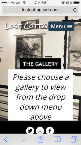
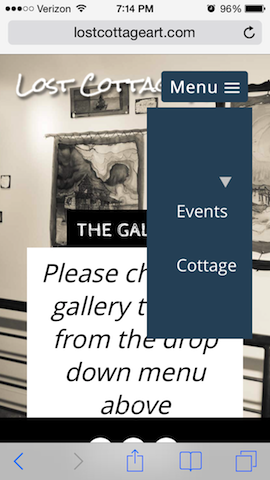
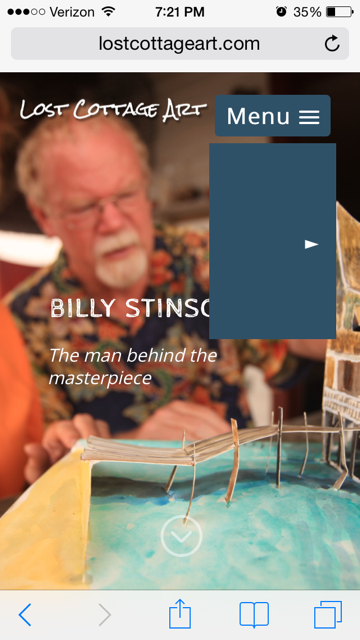
Second, My menu pages still don’t show up. I’m not sure if you can take a look on your mobile or not but when I click on the Menu at the top the drop down shows, but text not visible. When I touch an area the link shows but no way to see the navigation items. (see picture)
Also, it there a way to move my Footer Text Widget to the right on the iPad? For some reason it puts it all the way to to left under the social icons which looks pretty funny. (pic below)
Other than that I believe thats it.
Thanks for the info. I’ve tried to look at some books, but they are very daunting and I cannot comprehend anything out of them. I am a visual learner and I have to see it in action to remember, that’s why I wouldn’t do well coding. I like the idea of being able to see the real CSS as opposed to what Inspect Element shows, b/c it really doesn’t help like I wish it would. I have a Mac so I may check out CSSEdit.
Thanks a Bunch!! For the advice too!
Attachments:
January 15, 2015 at 18:55 #25605ModeratorWell crap. In pasting that code in there, I forgot the grater than sign would be escaped into a HTML entity on the front end. Use this. If it doesn’t get it, pick a different background color for the drop-down:
nav#top-menu ul li:hover ul a,
nav#top-menu ul li:hover ul a:visited,
nav#top-menu ul ul li.current-menu-item a,
nav#top-menu ul ul li.current-menu-item a:visited,
.slicknav_nav a,
.slicknav_nav a:visited  {
	color: #ffffff !important;
}
I’m afraid I don’t have a good option for you on the text widget on the iPad. It’s fixed in place with masonry and not easy to move.
Take care,
BillJanuary 15, 2015 at 20:18 #25607ParticipantBill you are the man! Thanks bud, I owe you big time! As for the iPad I guess it is, what it is.
You are a blessing and I appreciate your countless hours of support. You have a ministry whether you believe it or not.
Blessings,
MattJanuary 15, 2015 at 20:28 #25610ModeratorThanks Matt. Have a great night 🙂
-
AuthorPosts


- The topic ‘Elite Mobile Issues’ is closed to new replies.