What triggers "Responsive" layout changes?
URL to the page in question:
-
Quick question…
What triggers these “responsive” layout changes?
The reason I ask is because when I resize my browser, before I get to 1024 x 768, the layout changes (responsive). I was hoping it would stay the same at least until the screen size dropped below 1024×768.
Jack,
Thank you for your business first of all. Great question too. The responsive styles will kick in once the browser’s window (including scrollbars is 1023 pixels wide).
The styling section that controls that starts on line 1642 in the style.css file:
@media only screen and (max-width: 1023px) {
We picked that width so that on an iPad in landscape view, it would still have the same layout as a desktop browser typically would have.
If you’d like to make changes to how that works, just let me know what you’re looking to do and I’ll point you in the right direction.
Thanks,
Bill
Bill,
Thanks for the speedy reply. 🙂
That all makes perfect sense…except maybe I am noticing some other issue.
It’s easier to show that try to explain.
Here is a quick screencast showing your Authentic Theme Live Preview…
http://screencast.com/t/JbYXi9vsOr2i
Notice that as I resize the browser, you can see the browser dimensions in the lower right hand corner.
See how the header navigation text wraps below the logo before the screensize reaches 1024×768?
I’d like for that not to happen until at least the browser size hits 1023×768, but so far, I can’t find the reason why this navigation drops down “early”. 🙂
Any ideas?
Thanks!
Jack,
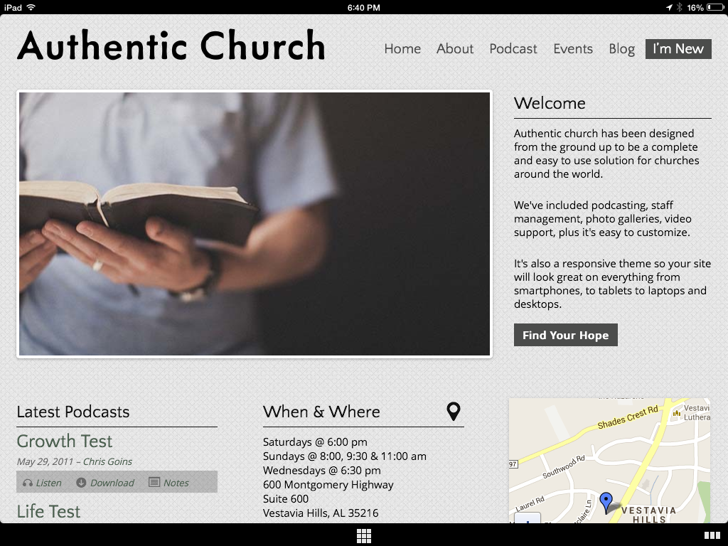
Thanks for the video. I believe that’s what it’s doing. I took a look on my iPad (see attached screenshot) which has a fixed resolution of 1024 by 768 pixels and it’s still keeping the navigation to the right of the logo.
You can also take a look in this responsive screen size tool http://www.responsinator.com/?url=demo.organizedthemes.com%2Fauthentic%2F
If I can help, let me know.
Thanks,
Bill
- The topic ‘What triggers "Responsive" layout changes?’ is closed to new replies.

.