
Fiddling with widgets
Support Area › Forums › Live › Fiddling with widgets
- This topic has 6 replies, 2 voices, and was last updated 8 years, 6 months ago by
Bill Robbins.
-
AuthorPosts
-
September 17, 2015 at 00:40 #32833
ccsl
ParticipantHi there,
Firstly, thank you again for your amazing help with this project. I really can’t tell you how wonderful your support has been and how pleased I am with the results!
I have one last nagging question with widgets. On the page I have linked, I have put a Google Calendar link into the right widget. I would like it to match visually with the other widgets so I put a frame around it. Is it possible to have the size of the box match the others (so be a set, unchanging height)? At the moment it gets larger or smaller depending on the amount of content.
If that is possible, what will happen when the length of content exceeds the length of the box? Will it be able to include a up/down slide function?
Finally, can I remove the tiny white gap that has appeared on the bottom of each widget, in between the bottom of the image file and the border itself?
Many thanks for your advice as always.
SimonSeptember 17, 2015 at 00:41 #32834Participant(This shows you what I have in mind.)
Attachments:
September 17, 2015 at 09:26 #32840Bill Robbins
ModeratorHi Simon,
You can do that. Let’s set a height for it. We’ll also set the overflow to be hidden but the vertical overflow to add a scrollbar if there is more content than space for it. Add this to the bottom of your child theme’s style.css file:
#home .widget_gce_widget {
	height: 179px;
	overflow: hidden;
	overflow-y: auto;
	padding: 10px !important;
	border-top: none;
}

#home .widget_sp_image img {
	margin-bottom: -3px;
}
see if that doesn’t do the trick for you. It’ll also move the bottom border of the image widgets up just a bit so there’s not a gap there.
Let me know if you run into trouble,
BillSeptember 23, 2015 at 02:02 #32943ParticipantHi Bill,
I think this will be the last time I need to practice on your kindness, patience and knowledge!
Our website has now gone live, http://www.ccsl.org.au and I have changed the way that the Google Calendar works in the widget–I have now exported Google’s own HTML into a text widget. That was the only way I could ensure it updated properly (the GCal plugin was not functioning properly).
However, I can not get the calendar to fit properly. There are two issues I would like to address, the first much more important than the second.
1. Is it possible to set the “fill” or “background” of the right widget to be the same colour as Google’s light-blue background? That way, no one will notice the little white lines on the right and on the bottom, where the calendar isn’t as big as the widget is. They are even more noticeable on a phone.That is my ‘quick fix’, but my ‘ideal fix’ is,
Is there a way to customise the Google HTML so that it completely fills the widget (and is proportional so it fills it on every device, computer, phone, ipad?) I would also love to be able to tell it NOT to cut text off (you see the 12.15pm Wednesday or 7pm Friday events are getting cut off, instead of running over two lines). I understand this may be much more complex, so I am happy with the quick fix if that’s all that is possible, but I would really love it if this was able to be done.Many, many thanks
SimonAttachments:
September 23, 2015 at 11:12 #32946ModeratorHi Simon,
Good questions. I believe we can cause it to keep the white border from showing up. iFrames are essentially small web pages from another site that are loaded into the content of another page. Because of that, the receiving page has limited control over what happens inside of the iFrame. Items like the height and width can be affected since that’s the top element which becomes part of the receiving page. What’s inside the frame is out of reach of the receiving page’s ability to change. Generally those changes have to be made where ever the iFrame is configured.
Let’s try adding this to the bottom of your child theme’s style.css file:
#home-right .textwidget {
	background-color: #e3e8ff;
}

#home-right iframe {
	border-radius: 0 !important;
	border: 0 !important;
	width: calc(100% + 3px) !important;
	margin: -3px;
	padding-top: 5px;
	padding-left: 3px;
}
See if that won’t help eliminate the white space around the calendar’s iframe. Let me know how it goes,
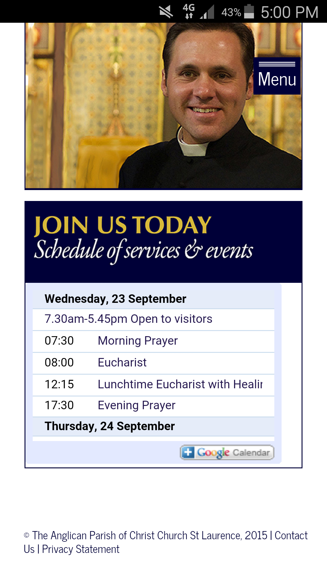
BillSeptember 25, 2015 at 00:39 #33000ParticipantHi Bill,
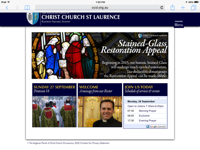
Thanks so much! That has fixed the problem with the box. Now it looks like it is supposed to be there, and with a bit of clever tweaking on my part, I have stopped the text from running off the edges–mainly by shortening the names of events!
However I have noticed a glitch has crept back in. On an ipad, the right widget is slightly longer than the others (see the screenshot). However, this doesn’t appear the case on a computer (see the second screenshot). What have I done wrong? The right widget is made up of two parts: an image widget, which is the blue box saying “JOIN US TODAY” and below that a text widget which takes the following feed, from Google:
<!– Responsive iFrame –>
<div class=”responsive-iframe-container”>
<iframe src=”https://www.google.com/calendar/embed?title=Schedule%20of%20services%20%26%20events&showTitle=0&showNav=0&showDate=0&showPrint=0&showTabs=0&showCalendars=0&showTz=0&mode=AGENDA&height=199&wkst=1&bgcolor=%23ffffff&src=eoigu2b0fqck637kcrj6tbpthg%40group.calendar.google.com&color=%2323164E&ctz=Australia%2FSydney” style=” border-width:0 ” frameborder=”0″ scrolling=”no”></iframe>
</div>I used the responsive frame <div class… etc so that it was the same size on all devices and the Google component filled the widget on all devices. But now, I just need to get the widgets to be exactly the same height on all devices, and I can officially say our new website is complete.
Thanks so much,
SimonAttachments:
September 25, 2015 at 14:41 #33005ModeratorIn your child theme’s style.css file, locate this section:
@media only screen and (min-width: 768px) and (max-width: 1024px) {

	body {
		background-image: none !important;
	}

	#header-content,
	#footer {
		width: 760px;
	}

	#navigation .menu li {
		float: left;
	}

	.wrap {
		width: 700px;
		padding: 30px 30px 45px;
	}

	#content {
		width: 700px;
	}

	.home #home-left,
	.home #home-middle,
	.home #home-right {
		width: 227px;
	}

}
and change it to be like this:
@media only screen and (min-width: 768px) and (max-width: 1024px) {

	body {
		background-image: none !important;
	}

	#header-content,
	#footer {
		width: 760px;
	}

	#navigation .menu li {
		float: left;
	}

	.wrap {
		width: 700px;
		padding: 30px 30px 45px;
	}

	#content {
		width: 700px;
	}

	.home #home-left,
	.home #home-middle,
	.home #home-right {
		width: 227px;
	}

	.home #home-right iframe {
		height: 160px !important;
	}

	.home #home-right #text-3 {
		height: 160px;
	}

}
See how that goes,
Bill -
AuthorPosts


- The topic ‘Fiddling with widgets’ is closed to new replies.